

Colour Guide
At its core, print is simply colour applied to a chosen material. Whether you are producing a single-colour design on thick uncoated stock or a vibrant full-colour product on premium board, the final result depends on how colour and paper work together.
Below, we’ll explore the different colour modes used in print, explain what’s required for accurate reproduction, and share practical tips to help you prepare your artwork for the best possible printed outcome.
Below, we’ll explore the different colour modes used in print, explain what’s required for accurate reproduction, and share practical tips to help you prepare your artwork for the best possible printed outcome.

CMYK
CMYK stands for Cyan, Magenta, Yellow and Black (the K refers to key which is ‘key colour’ or black!) this is the most widely used method for printing and the one we use at Better Printing on both our Offset Litho and Digital presses.
This method is also referred to as ‘four’ or ‘full ‘colour process and involves using the four colours in various mixes to create and reproduce the full colour palette required for all print jobs. While CMYK printing does an incredible job on most colours there are times when it is limited in its reliability and for strict brand guidelines you may need to use a Pantone colour.
This method is also referred to as ‘four’ or ‘full ‘colour process and involves using the four colours in various mixes to create and reproduce the full colour palette required for all print jobs. While CMYK printing does an incredible job on most colours there are times when it is limited in its reliability and for strict brand guidelines you may need to use a Pantone colour.
Pantone
The Pantone Matching System (PMS) use numbers to identify specific colours, the system uses a strict mixture of pigments to create the ‘spot’ colours that are then used for single colour inks. The Pantone system has many special specific categories it can produce, such as metallics, fluorescents (neons) and pastels.
We have a five colour press so we can run a CMYK job with a 5th Pantone colour as well at the same time. If additional colours are needed they can be ran through the press again, alternatively up to 5 Pantone colours could be run on their own.
We have a five colour press so we can run a CMYK job with a 5th Pantone colour as well at the same time. If additional colours are needed they can be ran through the press again, alternatively up to 5 Pantone colours could be run on their own.
RGB
RGB stands for Red, Green and Blue and is an additive colour mode that is used for screen displays such as Televisions projectors and of course computer screens!
We cannot print in RGB so there has to be a conversion to CMYK, this has traditionally been problematic as the conversion results can be unpredictable, and something that looks full and vibrant on screen due to the interaction of light can, look dull and washed out on paper sometimes. Modern RIPS (raster image processors) however are now very good at converting between colour modes, particularly with photographic images.
We cannot print in RGB so there has to be a conversion to CMYK, this has traditionally been problematic as the conversion results can be unpredictable, and something that looks full and vibrant on screen due to the interaction of light can, look dull and washed out on paper sometimes. Modern RIPS (raster image processors) however are now very good at converting between colour modes, particularly with photographic images.

Cyan, Magenta, Yellow, Black
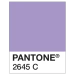
Pantone Matching System
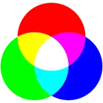
Red, Blue and Green
Colour Conversions
For best results, before submitting your artwork, ensure your design is saved in CMYK colour mode, this includes all photos and graphic elements.
Any items saved in RGB mode (red, green, blue; the colour mode for digital displays and web images) may show colour discrepancies after they have been printed by our CMYK printers.
To avoid any nasty surprises, it is best to convert any RGB artwork to CMYK. Just select File > Document Colour Mode > CMYK in Illustrator or Image > Mode > CMYK Colour in Photoshop and Save. If saving as a PDF, review the Save Adobe PDF dialog box and check that Colour Conversion in the Output tab is set to No Conversion.
If you’re working in InDesign, you can convert any RGB images within your design by saving as a PDF and selecting the Press Quality PDF preset in the Save Adobe PDf dialog – then in the Output tab, select Convert to Destination (Preserve Numbers) and select a CMYK profile.
Any items saved in RGB mode (red, green, blue; the colour mode for digital displays and web images) may show colour discrepancies after they have been printed by our CMYK printers.
To avoid any nasty surprises, it is best to convert any RGB artwork to CMYK. Just select File > Document Colour Mode > CMYK in Illustrator or Image > Mode > CMYK Colour in Photoshop and Save. If saving as a PDF, review the Save Adobe PDF dialog box and check that Colour Conversion in the Output tab is set to No Conversion.
If you’re working in InDesign, you can convert any RGB images within your design by saving as a PDF and selecting the Press Quality PDF preset in the Save Adobe PDf dialog – then in the Output tab, select Convert to Destination (Preserve Numbers) and select a CMYK profile.
Need Help Preparing Your Artwork?
If you’re unsure about colour settings, file setup, or converting your artwork for print, our team is happy to help. We can advise on the best colour mode, profiles, and export settings to ensure your files are print-ready and produce accurate results. Get in touch if you’d like guidance before submitting your artwork or need clarification on any of the information above.