Design Tips
Read our top tips for designing effective flyers and leaflets!
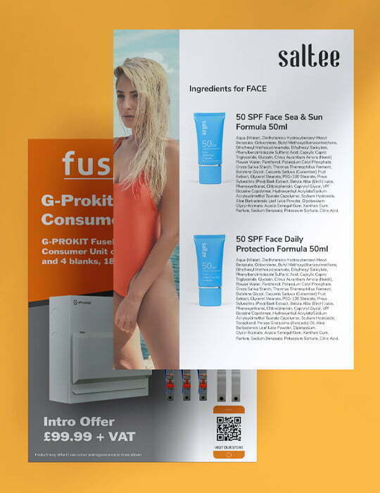
Creating your own print-ready flyer and leaflet artwork from scratch can be challenging – particularly for smaller businesses with no graphic design team to fall back on. Here’s some tips to help you craft your own super-attractive, eye-catching flyers and leaflets!
1. Select the right size
Flyers and leaflets come in a range of sizes, each being suitable for a different purpose. See the list below for our most common sizes and their popular uses:
DL – Standard sized to fit inside envelopes making them perfect for your company mail distribution.
A6 – These postcard sized flyers and leaflets are perfect for street distribution or posting through letterboxes.
A5 – Takeaway menus and event invites are best printed in this handy sized product.
A4 – Used to display a large amount of information – perfect to fold and pop through letterboxes. Popular to promote supermarket offers.
A3 – Perfect as a display tool, similar to a poster. Pop up inside at your club promotion event.
A2 – Our largest size leaflets and flyers, again a great way to pin up information on a display board.

2. Language and The Headline
Making the language suit your audience can be the hardest part! Think carefully about who you are targetting before composing your content. Show customers that you are the solution to their problem – use attention-grabbing text such as “free”, “available now” or “make money”.
When a leaflet or flyer is posted through someone’s door, the first thing they look at is the headline so make sure your is perfect! You have a short space in which to grab their attention. Can you entice the reader in with a sale or offer? If you are handing out your leaflets to passerby, make them an offer they can’t refuse, like, “10% off when you order today”.
3. Image or Images
Flyers are commonly used to display one or two images or products or catchlines, whereas leaflets tend to use informative images to display guides or tips. Whatever the product, it is important to ensure you use eye-catching images that make your reader want to find out more! Break up a text-heavy leaflet with images to keep your readers attention.
4. The Content
Make sure your content is easy to read, accurate and understandable. The less text people have to read – the more likely they are to read it! Leaflets and flyers are designed to share a message rather than a story. Readers will want to be able to scan the leaflet to pick our information that is relevant to them. Add a Call-To-Action to let people know what they can do after reading your flyer. Make sure your contact information is easy to find, add a QR code to direct potential customers to your website. Don’t write boring content if you want to be noticed!
5. Distribution Methods
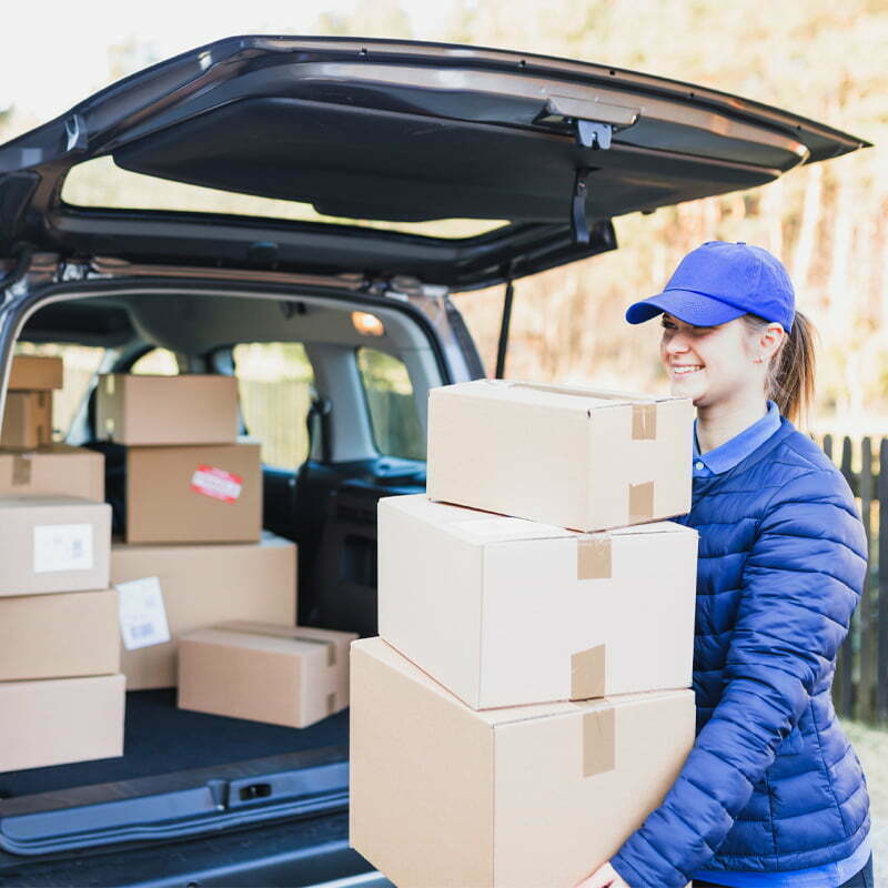
Flyers and leaflets are a cost-effective way to reach a large quantity of people. Try different ways to distribute your leaflets and flyers; handing them to potential customers in the street can add a personal touch. Posting your flyers through letterboxes means customers can read them in their own time and have access to their phone or computers to head to your site and order online! Getting the right method will involve some trial and error but don’t give up! Monitor which method gives you the most success and keep this in mind for your next promotion!
6. Do it all again!
We understand that designing leaflets and arranging for their distribution can be time consuming but when the orders come flying in, your will realise it was all worth it. So what next? Do it all again! This time add offers for returning customers too, or use them to remind people about the event you are hosting. As customers begin to recognise your professional leaflets and flyers they will feel more confident to order again!

Need help with preparing your design?
Get in touch for expert advice and support today