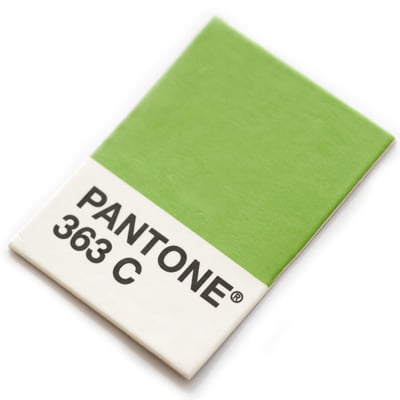
Pantone Colours®
Most colour printing is done digitally or on a litho press using the 4 colour printing process, which consists of the 4 inks Cyan, Magenta, Yellow and Black or CMYK for short.
All colours for any design can be successfully and accurately produced using different amounts of these colours, if you were to look under an eye glass you would be able to see the dots of the different colours that make up the images from these four inks.
However for consistent accuracy and perfect colour matching there is no better solution than Pantone colours.
What are Pantone Colours
If you print with a Pantone colour you are getting just that specific colour pre made and mixed with strict and specific percentages and pigmentations.
Pantone colours are referred to by their own specific numbers or sometimes just a colour such as Warm Red and other times paired with a specific colour such as Orange 021.
The standardisation of all these colours is managed by the Pantone Color Matching System (PMS), which is used worldwide, in the form of colour books which are made of printed swatches of the exact Pantone colour printed on a specific stock.
A good press minder will use these one of these books as a reference to match to the Pantone colour on the print job they are producing.
Points to consider
Paper Types
Pantone produce several colour books (or sometimes a combined one) for the paper types, a coated version and an uncoated version they both use the same ink and have the same numbering system but the numbers are suffixed by a U for uncoated and a C for coated.
Even though the ink is the same it will look much different on the 2 stock types, Coated paper will produce a more vibrant look while Uncoated will give a more dulled finish as uncoated paper is more absorbent of ink.
Printing Press
You are only able to print Pantone colours on a litho press, a Pantone colour will need its own colour unit which will be cleaned or ‘washed up’ before fixing the pantone plate to the press, most bigger printers usually have a 5 or 6 colour press, this will consist of 1 or 2 extra units to be able to print single pantones or 4 colours plus additional pantone colours.
Pantone Guides
Overtime handling, light, humidity, and paper ageing will cause colours to become inaccurate so it is advisable to keep any Pantone books or guides refreshed, most good printers will do this but if you are a designer or brand manager who has their own book it is worth remembering.
Solid metallic areas
If you are using a metallic spot colour such as Silver 877 as a large solid area the silver ink on when printed on paper will be opaque.
Any additional ink printed on top of the silver will not stick to it properly unless the silver has been “knocked” or reversed out by the content or text being used to sit on top. A lot of modern RIPS will automatically adjust the trapping to accommodate this but to prevent any issues in indesign or illustrator go to the attributes pallet ( Output>attributes) and make sure the overprint fill and overprint stroke are unchecked.
Budget Tip
You can use 100% cyan or magenta on its own as an alternative to a pantone colour as these colours are a pure colour.
Combined with a simple black you can create nice looking print designs without having to pay for an additional spot ink colour!
